
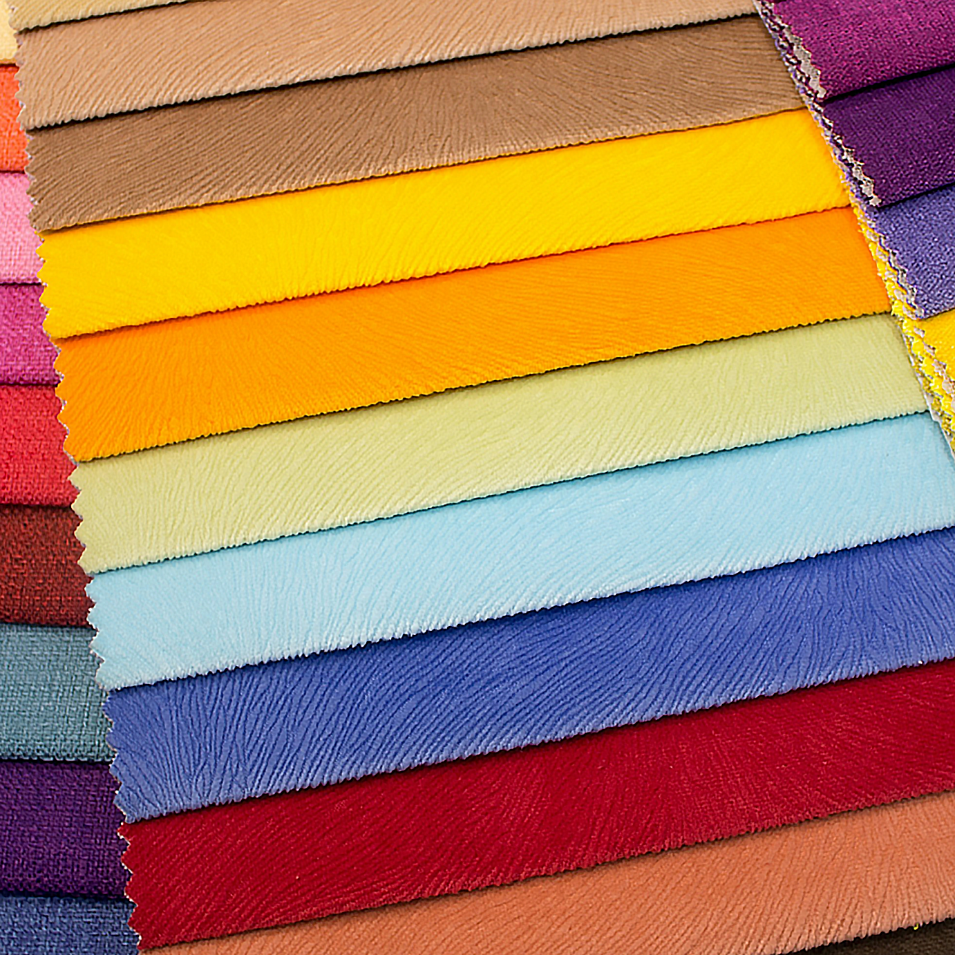

At the venue walk-through, the planner holds a table runner sample against the fabric proposed for a sewn accessory. Both carry the same color name. Under the reception lights, the runner looks warm and the accessory looks cool. The maker is ready to cut, but whose version of the color is the team approving?
If décor and accessories are approved separately from online images, that question may not surface until the pieces meet at setup. We would settle it with the actual fabrics, in the places and light where guests will see them, before committing to yardage.
Color is something you see on a surface, not a promise contained in its name. A satin runner can reflect a light source sharply, while a matte poplin accessory scatters light more evenly. Chiffon or mesh may take on the color of the lining, tablecloth, or wall behind it. Even two pieces cut from the same fabric can appear different if one is backed and the other is not.
Lighting can change the relationship again: samples that look close in daylight may separate under the fixtures used for dinner. The goal is not to declare an exact match across unlike materials. It is to decide whether they make a coordinated palette in the wedding’s actual setting — and to identify any difference that will look accidental when the pieces sit together.
Get a physical sample of every proposed fabric before approving the palette. Keep the material in its intended form as much as possible: put a sheer over its planned lining, place the runner on a representative tablecloth, and hold the accessory against the garment or surface it will accompany. A loose swatch viewed against a white desk may answer a different question from a finished piece viewed against an ivory backdrop.
Start where the fabrics will touch or share a backdrop. Put the proposed runner and accessory samples next to one another, rather than approving each against a separate reference image. Then step back to the distance from which guests will ordinarily see the arrangement. A slight difference that draws the eye at a seam may disappear across a room; a near-match that seemed harmless in the hand may look uneasy across a full table setting. There is no universal distance or numerical tolerance that replaces the team’s decision.

For planners coordinating linens and backdrops, designers making bridal accessories, and home sewists handling favors or café curtains, this small-scale check protects a much larger job. We offer fabrics by the yard across workhorse basics and dressier surfaces, with low minimums that can make exploring alternatives practical. Check the current options and availability before treating any sample as a production choice.
Repeat the side-by-side check in relevant daylight and under the lighting planned for the event. If the ceremony or reception spans afternoon and evening, look at both conditions rather than choosing whichever makes the fabrics agree. If a particular pairing will be seen mainly during dinner, record that evening lighting as the condition governing its approval — but note any visible difference earlier in the day.
Use the intended fixture settings when possible, and keep the backing and placement consistent between checks. Take photographs so absent collaborators can understand what was compared and where. Do not use a phone image as the final color standard: its camera, screen, and viewing conditions can change the apparent result. The labeled physical samples remain the references for approval.

When the Samples Do Not Agree
First decide whether the difference is visible in the placement that matters. Give priority to pieces that touch, repeat across the same tables, or appear against one shared background. If the mismatch remains distracting, choose a response before either team cuts:
- Accept the visible difference if the planner and maker agree that the fabrics read as a coordinated palette in the governing light.
- Place the materials in distinct zones if they work separately but look mismatched side by side.
- Make a tonal contrast intentional by choosing a clearly lighter or darker relationship instead of defending an uneasy near-match.
- Test a replacement fabric or backing in the same setting before changing the approved design or ordering yardage.
Write down which option the team chose. “Close enough” is hard to act on later unless it refers to specific samples, placements, and lighting.
One Small Sign-Off Can Protect the Whole Palette
Suppose the planner proposes a satin table runner and the maker proposes a poplin accessory in a similarly named shade. On the reception table, with the accessory placed beside the runner, the poplin looks cooler in daylight and more noticeably so under the planned evening lights. The team tries a different accessory backing, but the difference remains. Rather than approve both independently, they choose a deliberately lighter accessory shade and check the new pairing under both conditions.
The written record can be short: identify the runner and accessory samples, their intended placements, the daylight observation, the evening light chosen to govern approval, the decision to use a lighter accessory, and the person authorized to sign off for each part of the job. The planner and maker then have one shared answer when sourcing, cutting, and setup begin.
Carry the Approved Samples Into Production
Label and retain each approved physical sample with its use, backing, governing light, and sign-off owner. From there, calculate yardage for the actual pattern pieces and décor dimensions, including allowances appropriate to the project. Before purchasing from us, confirm current availability, the length of continuous yardage needed, and any batch or dye-lot considerations for pieces that will sit next to one another. For larger runs, ask about applicable volume purchasing options; neither a single order nor a shared supplier guarantees identical color across different fabrics or lots.
When the yardage arrives, compare it with the signed-off samples on the same backing and, where practical, in the governing light before cutting. If it reads differently, pause and resolve that difference with the planner and maker while the fabric is still intact. The approved samples are a workroom staple for this stage — not just a reminder of what looked good, but a reference the whole team can use.

